
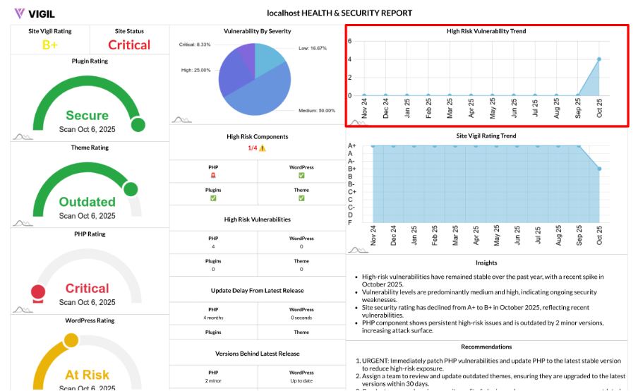
Trends Chart: Tracking High Risk Vulnerabilities Over Time
The Trends Chart helps you track the evolution of your site's highest impact risks month by month, allowing you to see if your site is becoming more secure or if vulnerabilities are increasing over time.
What It Shows
The Trends Chart provides a time series of monthly totals for High and Critical vulnerabilities across your entire site. It includes:
- A monthly count of High and Critical vulnerabilities across four components:
- PHP
- WordPress core
- Active theme
- Active plugins
Each data point represents the combined High + Critical count for that month, giving you a clear picture of how risks are evolving.
How It Works
Here’s how the Trends Chart calculates and displays your vulnerability data:
- Monthly Collection: It collects monthly counts of High and Critical risk findings for each component.
- Summing: The High and Critical issues are summed per component to give a total for each month.
- Output: The chart outputs a clean time series, where each point represents:
- Label: The month (e.g., "Oct 24")
- Value: The combined High + Critical issue count for that month.
Input and Scope
You can define the scan_id (which site scan to analyze) and the timeperiod (e.g., 12 months, 6 months) to decide how far back to track the data.
Output Example:
Here’s an example of what the output might look like:
- [{ year: "Oct 24", value: 7 }, { year: "Nov 24", value: 5 }, …]
Why It’s Useful
The Trends Chart is crucial for several reasons:
- Direction, Not Just Snapshots: It helps you see if your site’s risk is trending up or down over time, rather than just giving a snapshot of the current state.
- Measures Outcomes: It verifies whether your remediation efforts are successfully reducing High and Critical vulnerabilities.
- Capacity Planning: Spikes in the chart indicate when you should allocate additional patching time to address issues.
How to Read It
Here’s how to interpret the trends:
- Downward Trend: If the trend is going down, you’re successfully reducing serious risk. Keep your update cadence and maintenance schedule.
- Flat Line at Low Values: If the line is flat and low, your site is in a stable and healthy state. Continue maintaining updates and monitoring.
- Upward Trend or Spikes: If the trend is rising or you see spikes, investigate recent changes to your site, including new plugins, delayed updates, or other modifications.
Quick Actions from the Chart
Based on what you see in the Trends Chart, here are some actionable steps:
- If values rise:
- Prioritize patching Critical vulnerabilities first, then move to High.
- Focus on the components that are most risky, such as plugins, which are often the root cause.
- If values plateau:
- Focus on improving your update process, like scheduling monthly maintenance, automating minor updates, and reviewing vendors’ updates.
- After big updates:
- Re-scan to confirm that the trend drops as expected and that the updates have successfully addressed the vulnerabilities.
Best Practices
To get the most out of the Trends Chart, follow these best practices:
- Pair with Vulnerability Breakdown: Combine the Trends Chart with your Vulnerability Breakdown to understand the severity mix behind the trend.
- Use High Risk Components View: Use this view to pinpoint which component (PHP, core, theme, or plugins) is driving the spikes.
- Track Over 6–12 Months: A meaningful pattern will emerge when you track data over at least 6–12 months.