
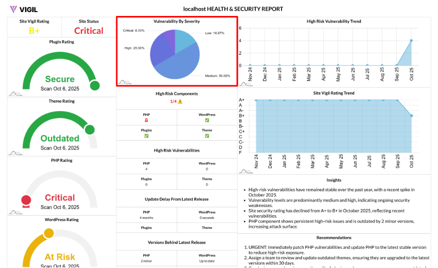
Vulnerability by Severity: How the Breakdown Chart Works
Understanding your site’s risk starts with a clear picture of severity. The Vulnerability Breakdown chart takes raw vulnerability data and turns it into an easily digestible distribution across Critical, High, Medium, and Low severities, allowing you to focus on what matters most first.
What It Shows
The Vulnerability Breakdown Chart provides the percentage share of vulnerabilities by severity across four key areas:
- Critical
- High
- Medium
- Low
The chart aggregates data from your latest scan, which includes:
- PHP
- WordPress core
- Active theme
- Active plugins
How We Calculate It
To calculate the breakdown:
- Total Count: We fetch the total counts for each severity from your latest scan.
- Sum the Counts: These counts are summed up to produce a grand total.
- Percentage Calculation: For each severity, we compute its percentage share of the total:
- percentage = (severity_count / total_count) × 100
- The result is rounded to two decimal places.
Why This View Is Useful
Here’s why the Vulnerability Breakdown chart is important for managing your site’s health:
- Prioritization: The chart helps you identify which areas need your immediate attention, particularly Critical and High vulnerabilities.
- Trend Anchoring: By comparing charts over time, you can track improvements in your site’s vulnerability severity distribution.
- Executive Clarity: The chart offers a compact and clear snapshot that can be easily shared in reports and updates to stakeholders.
Reading the Chart
Here’s how to interpret the chart:
- Large red/orange segments (Critical/High): Urgent remediation is needed for these areas.
- Dominant yellow (Medium): Plan fixes for these vulnerabilities in the current sprint or maintenance cycle.
- Mostly green (Low): These are low-priority issues; continue maintaining your cadence and monitor for any regressions.
- No data: This either means no vulnerabilities were detected or the scan has not populated the results yet.
How to Improve Your Breakdown
To improve your Vulnerability Breakdown:
- Eliminate Critical/High vulnerabilities first: Patch or replace vulnerable components immediately.
- Reduce Medium vulnerabilities over time: Schedule structured sprints for remediation of these vulnerabilities.
- Prevent Drift: Keep PHP, WordPress core, themes, and plugins on supported, up-to-date versions to avoid introducing new vulnerabilities.